Fournier type specimen in his own printed wrapper
Fournier type specimen in his own printed wrapper
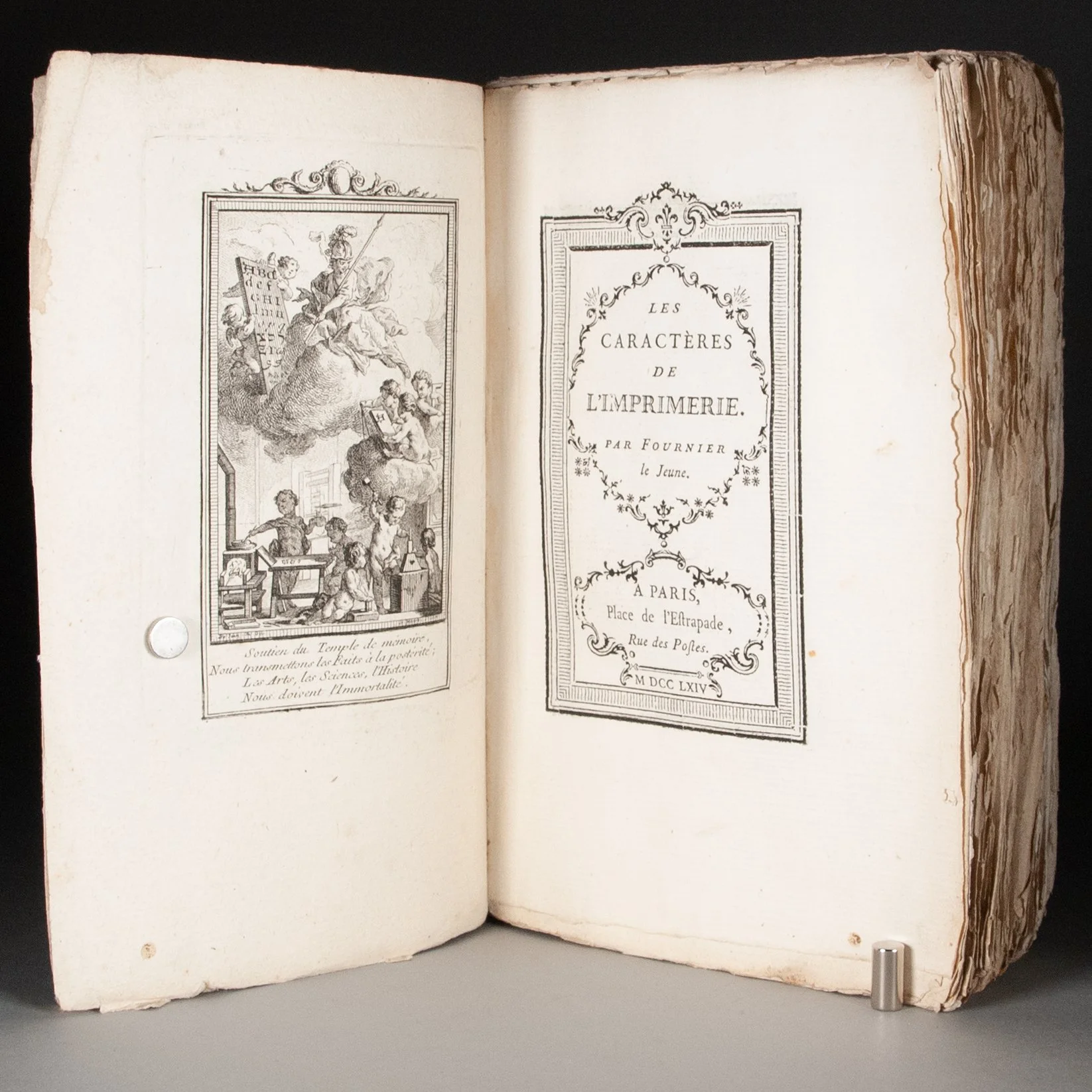
Les caractères de l'imprimerie
by Pierre-Simon Fournier (Fournier le jeune)
Paris: [Pierre-Simon Fournier], 1764 [1766?]
[4], 144 p., 145-184 leaves, 169-170 p., 187-250 leaves + [1] plate (frontispiece) | 8vo | pi^2 1-9^8 10-11^16 12^8 (12)1 13-16^16 | 180 x 115 mm
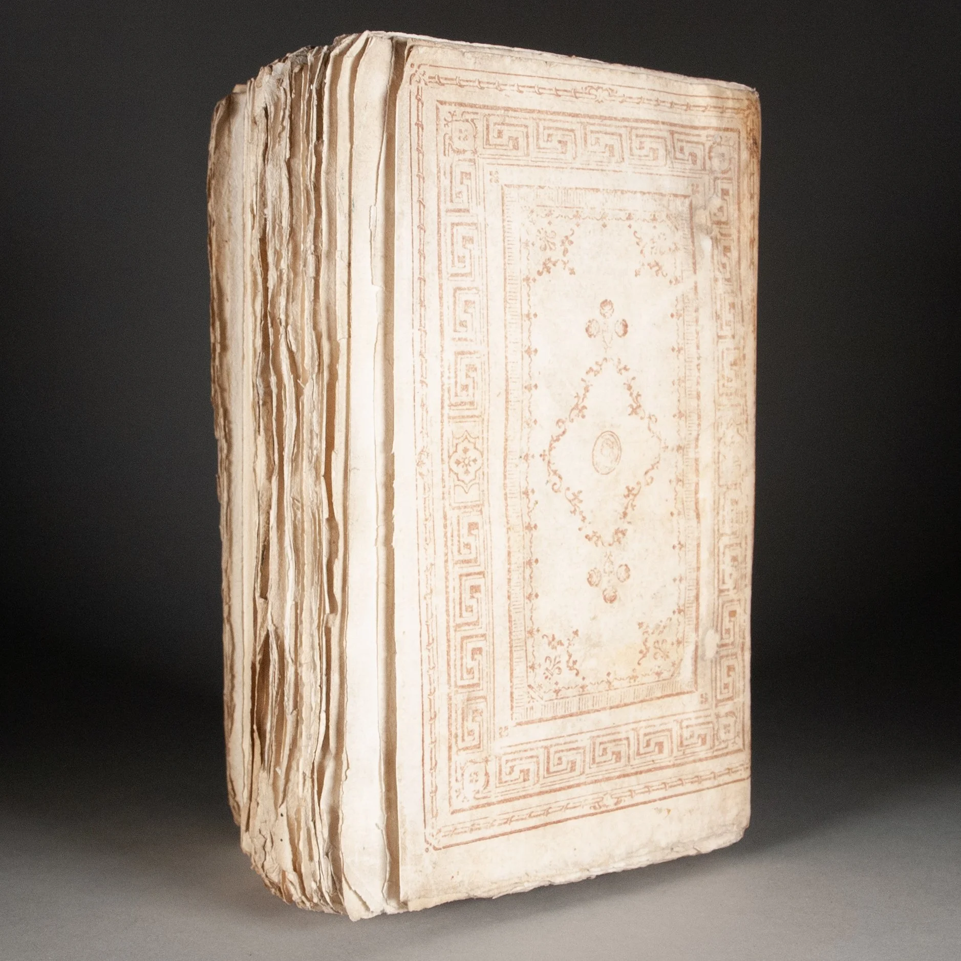
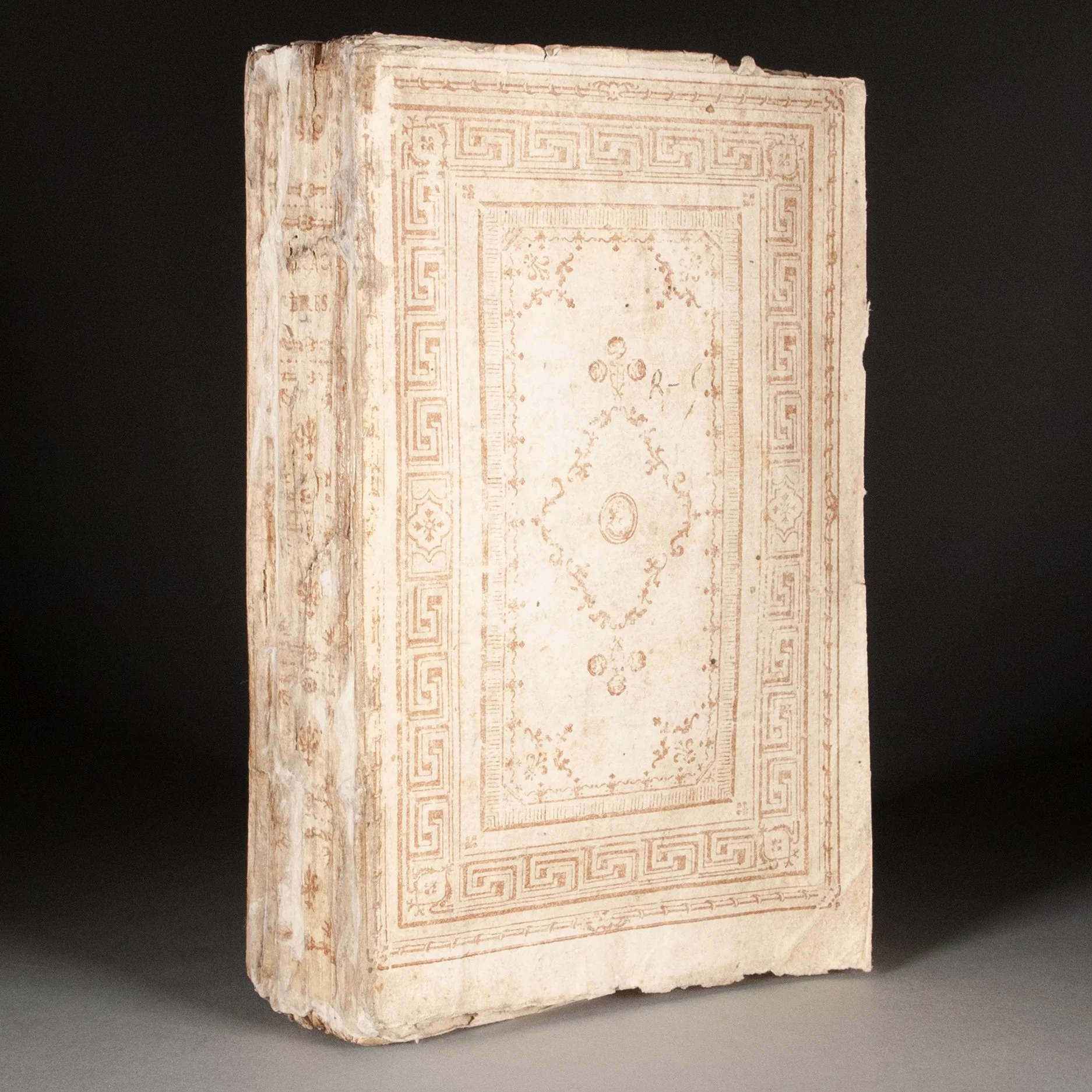
The second of Fournier's influential type specimens, a more ambitious follow-up to his 1742 Modèles de caractères. This 1764 specimen was reissued in 1766 as the second volume of his Manuel typographique (with a few additional paratexts). Fournier here showcases every alphabet imaginable, a wide variety of fonts for the Latin alphabet, countless different type sizes, music, a bewildering variety of ornaments—truly a typographic showstopper. Fournier "was among the most important typographers of eighteenth-century France, and not only because of his popular transitional type designs. He was also one of the earliest developers of a point system (including features such as a pica divided into 12 points) that is in use to this day" (Kelly). His fonts were used throughout Europe, and even Giambattista Bodoni, master printer of Parma, had of copy of this 1764 Caractères that bears evidence of use. ¶ Our copy is an expanded mixed issue, and an interesting transitional witness, made up mostly from 1764 sheets—with the proper 1764 title page—but with those sheets new to the 1766 issue here printed on one side only. We would normally interpret such unperfected sheets as proofs, except this condition is not unusual among copies of the 250-page 1764 issue (see OCLC 15433177, for example; you'll also find copies with 128, 167, and 170 p.). In the standard 1766 edition, however—if we accept the Getty copy as more or less ideal—those sheets have been perfected. Our singleton (12)1 also represents an earlier state of the leaf, retaining erroneous page numbers that have been corrected in the 1766 edition. ¶ Christie's London sold a copy much like ours in 2018, suggesting it might have been assembled from 1764 sheets and proofs of the 1766 issue. Zisska and Kistner sold another such copy in 2006, calling it a "preliminary issue" of the 1766 Manuel volume. The unlikely abundance of unperfected sheets leaves us questioning whether these are proofs. Even the St. Bride copy of a shorter 1764 copy was bound almost entirely from sheets printed on a single side. Still, we expect Fournier was more fastidious than the average printer. We can imagine him pulling more proofs than most, and perhaps deciding they were good enough to bind up as finished copies. ¶ Our copy in its original paper wrapper, decorated with Fournier's own type ornaments, and almost certainly printed by Fournier himself. He excelled at such work. "As a master of the cutting and arrangement of printer's ornaments, he produced florid title pages and headpieces that were dense yet tasteful and original. Pioneering work in multiple-piece type ornaments was done by Granjon and others, but Fournier developed and arranged the combination of these discrete but combinable pieces of metal into a new and more elaborate rococo style" (Kelly). Giles Barber found an identical binding, printed in blue instead of red, on another copy of the 1764 Caractères in the Broxbourne Collection at Cambridge. Strengthening the link to Fournier's own press, the wrapper is lined with two waste pages from the Caractères, again printed on one side only and perhaps proofs. The copy of p. 138 could theoretically have come from either edition, but this version of p. 139 belongs only to the 1766 edition. Fournier's method of decorating paper wrappers spread as the century wore on, and even spilled beyond France's borders. We find similar paper covers on Brussels imprints of 1775 and 1776, for example. ¶ An extraordinary copy of an extraordinary type specimen.
PROVENANCE: Our sheets 7 and 8 with scattered inked dashes and penciled plus signs in the margins.
CONDITION: In the original paper wrappers using Fournier's own type ornaments, as described above. Untrimmed and preserving registration pinholes. With a frontispiece illustration of putti running a press. ¶ Edges of the leaves a bit dusty, typical of untrimmed copies; just some light scattered foxing. The spine heavily repaired, with some losses filled; the upper inner corner of the rear cover also repaired; paper wrappers moderately soiled.
REFERENCES: Bigmore and Wyman, A Bibliography of Printing (1969), v. 1, p. 227 (calling it 167 p.) ¶ Jerry Kelly, Oone Hundred Books Famous in Typography (2021), p. 84 (cited above; "In addition, he made advances in music types, which have also influenced work done in this field to the present day"); D.B. Updike, v. 1, p. 262 (speaking of the 1766 specimen edition, which he says actually wasn't published until 1768: "The specimens of types are the most important part of the book. Some of them were lent him by Fournier l'ainé [his father], by the Paris founders Cappon and Hérissant, and by Breitkopf of Leipsic."), 264 ("Fournier's typographical ornaments are charming little designs rendered for typographic use just as such things should be. Only close examination reveals their variety and cleverness."); Yves Devaux, L'univers de la bibliophilie (1988), p. 202 ("Fournier's fonts and matrices were often used by French, Dutch, German, Italian, English, and Spanish printers"); Conor Fahi, Review of "The Manuel Typographique of Pierre-Simon Fournier le jeune," La bibliofilía 101.1 (Jan/Apr 1999), p. 94 (for Bodoni's copy of the 1764 Caractères); Giles Barber, "Continental Paper Wrappers and Publishers' Bindings in the 18th Century," The Book Collector (Spring 1975), p. 42-43 (on the Broxbourne binding: "Here Fournier's rococo elements, printed in blue, form panels on both the upper and lower covers of the grey paper wrappers while the spine is printed with five bands and in the second space bears the title CARACT-ÈRES. The panels are made up of an outer border of Greek key motif, an inner frame of Fournier elements, a lozenge shape of type ornaments with the famous head in the centre and roses above and below."; Barber cites similar examples through the 18th century), plate 10 (the binding reproduced, spine included); Paul Culot, Quatre siecles de reliure en Belgique 1500-1900, v. 1 #73, v. 2 #88 (for the Brussels bindings)
Item #913