Colored and uncolored, side by side
Colored and uncolored, side by side
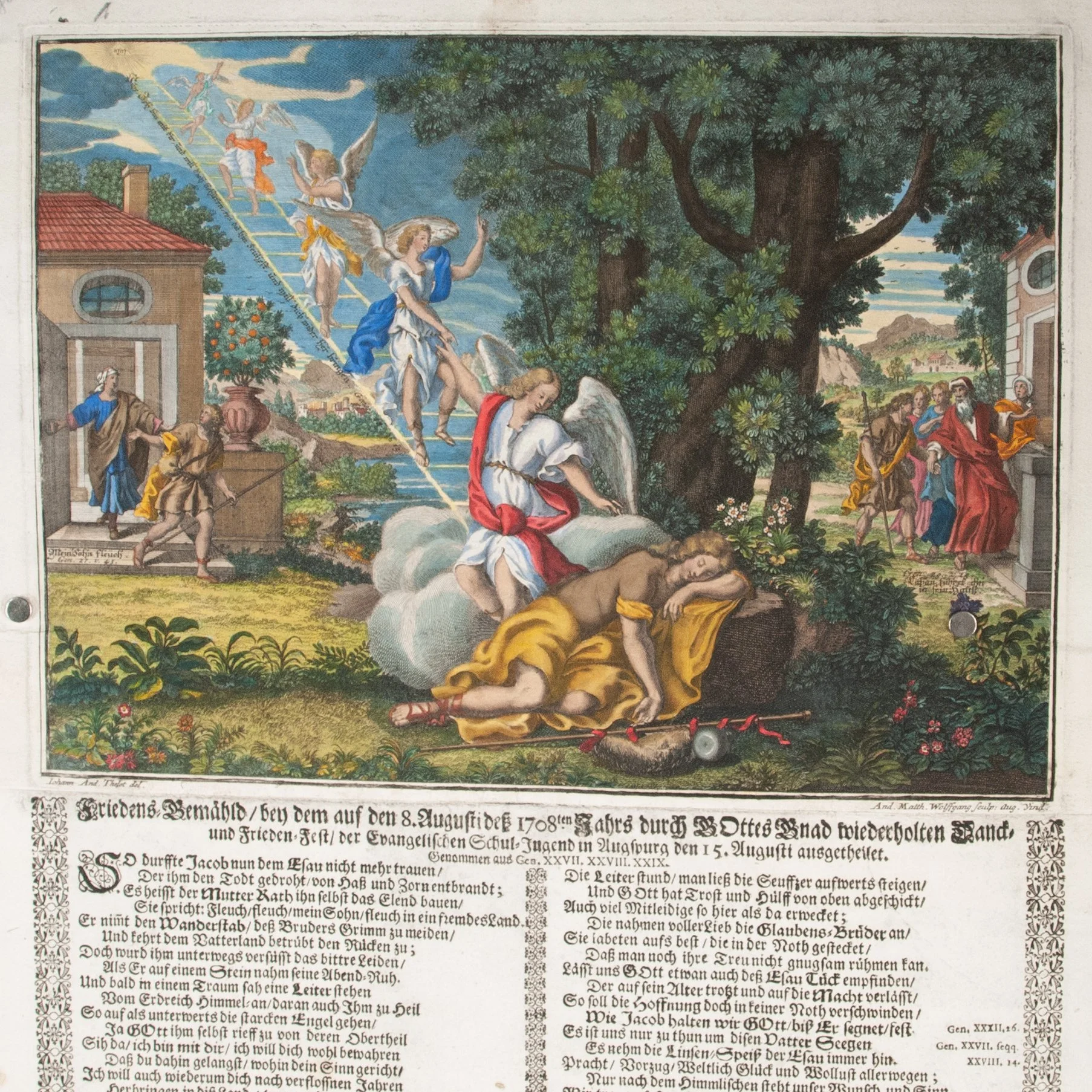
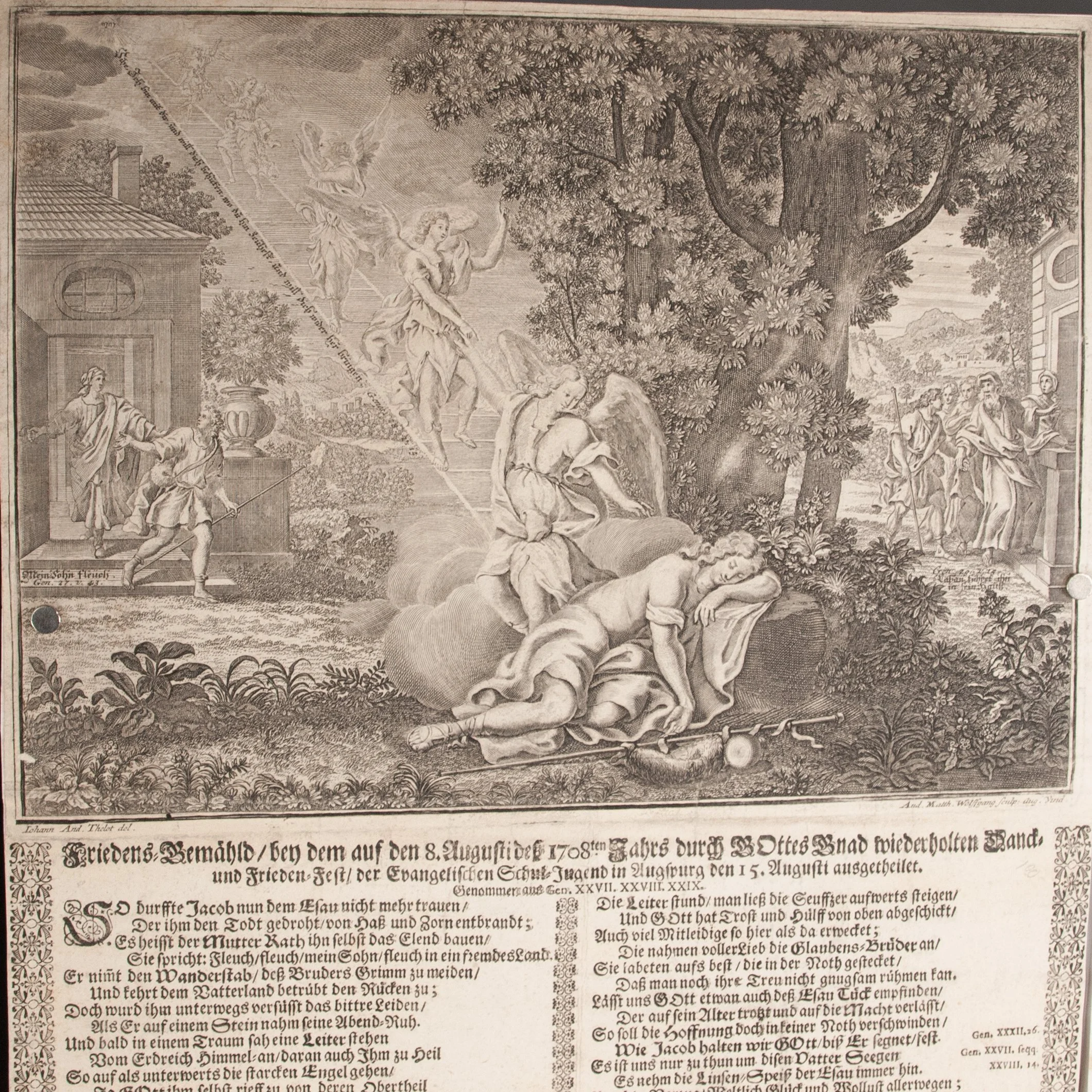
Friedens Gemähld, bey dem auf den 8. Augusti deß 1708ten Jahrs durch Gottes Gnad wiederholten Danck- until Frieden-Fest, der evangelischen Schul-Jugend in Augspurg den 15. Augusti ausgetheilet
designed by Johann Andreas Thelot (Thelott) | engraved by Andreas Matthäus Wolfgang
Augsburg, 1708
2 broadsides | Full-sheets | 451 x 315 (black-and-white); 480 x 333 (colored)
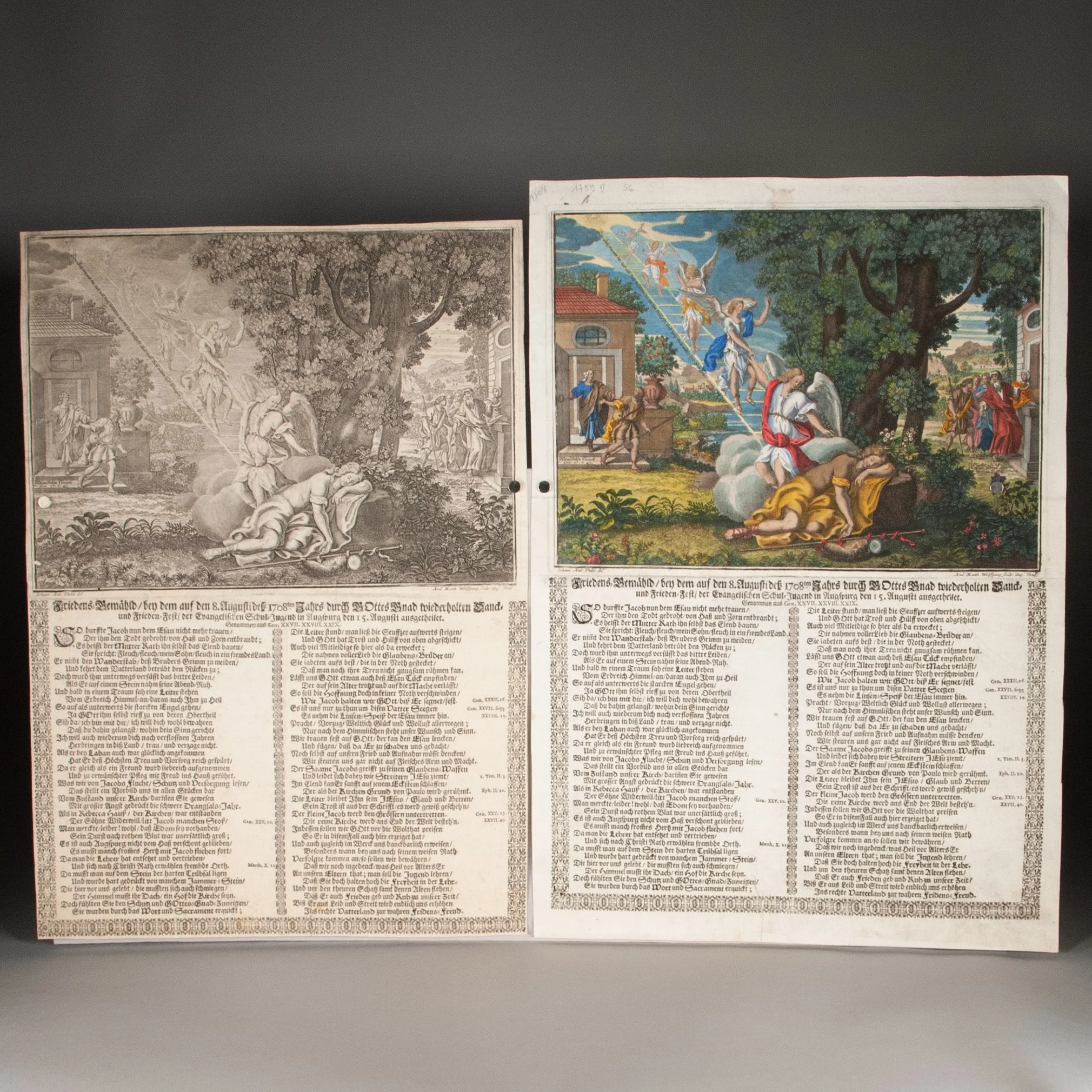
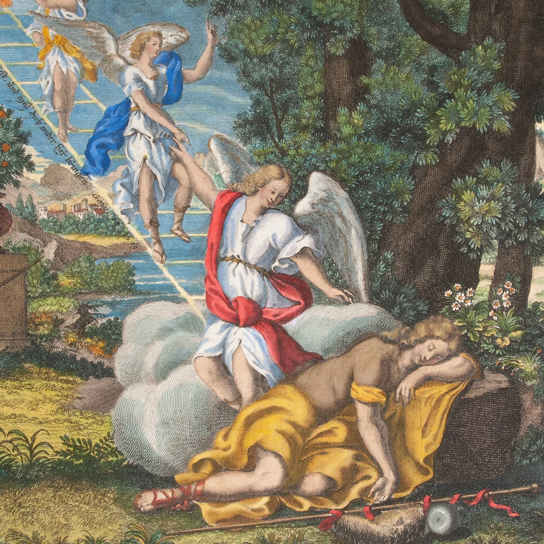
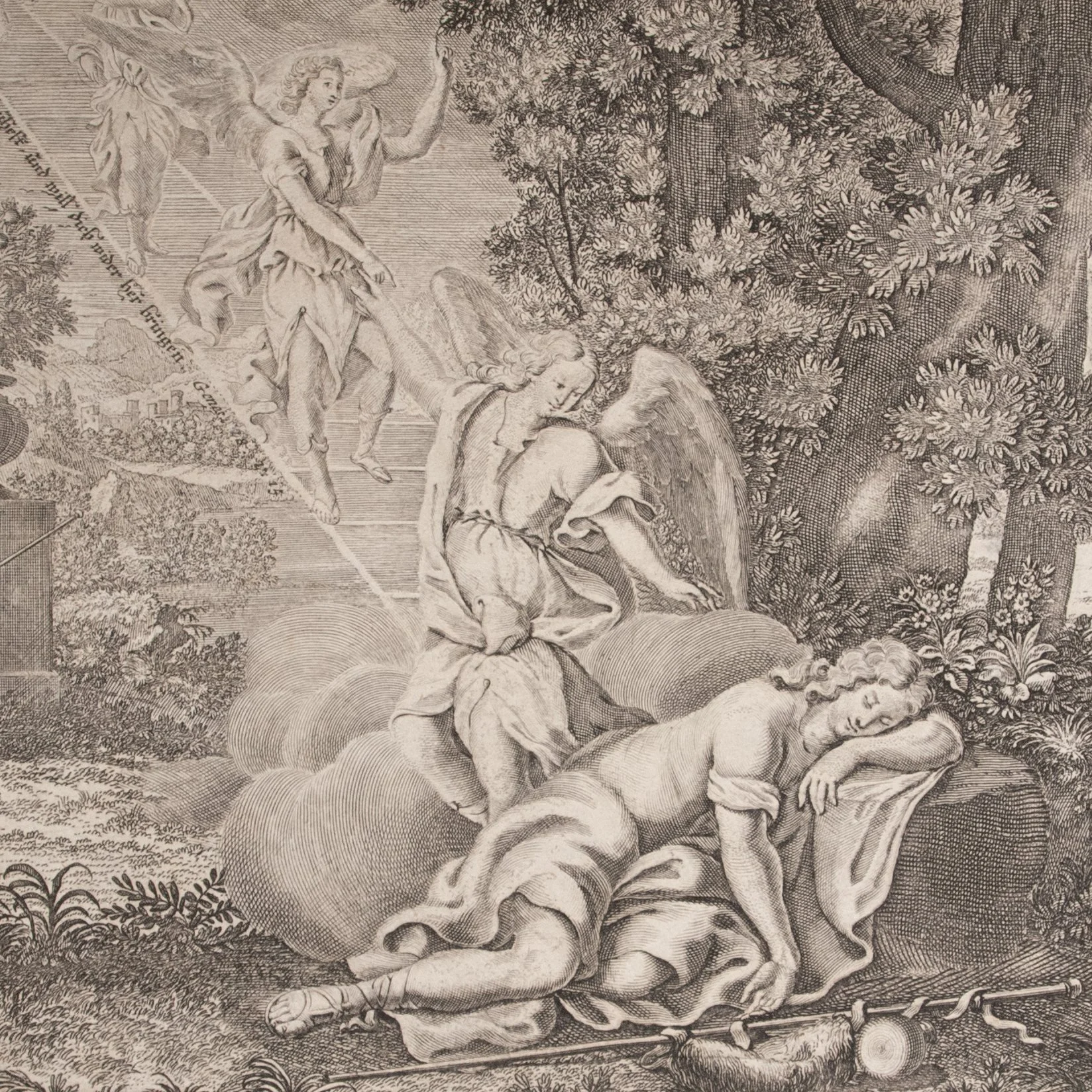
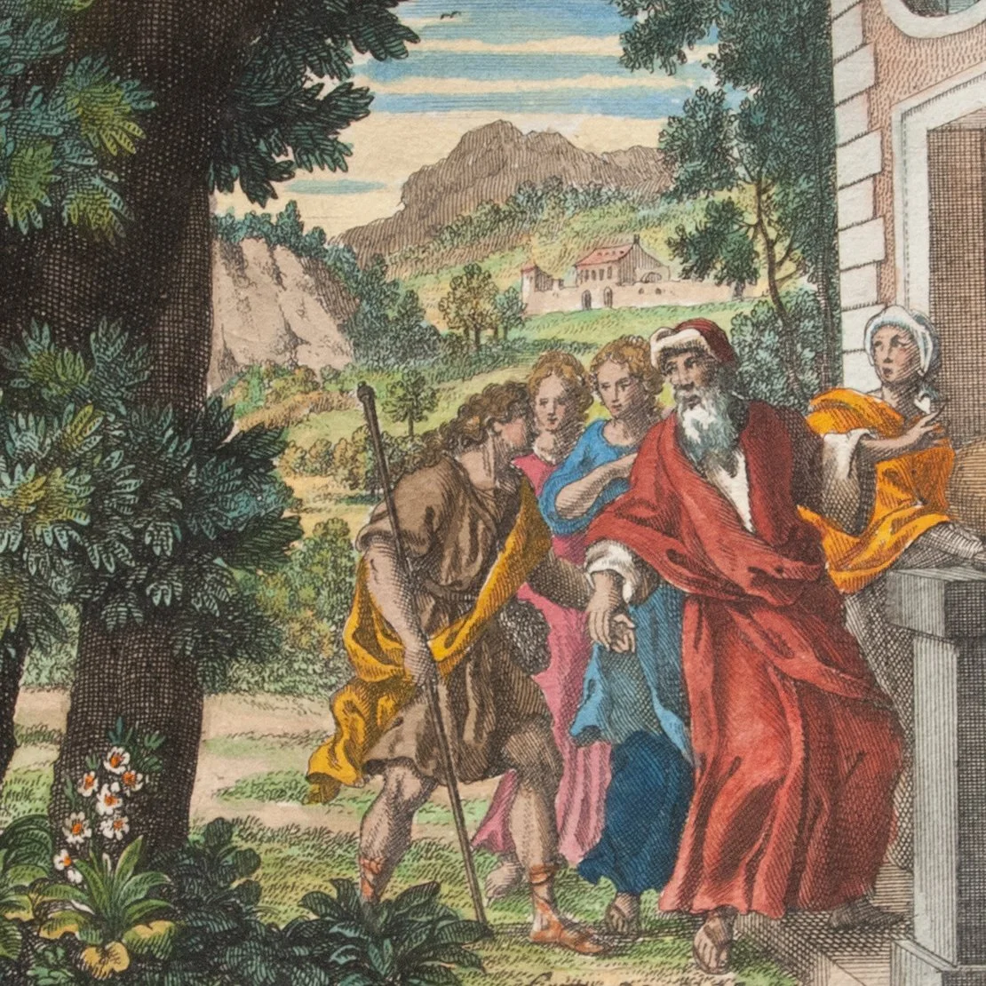
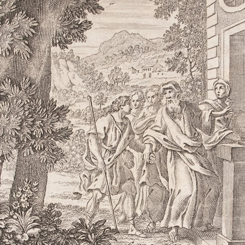
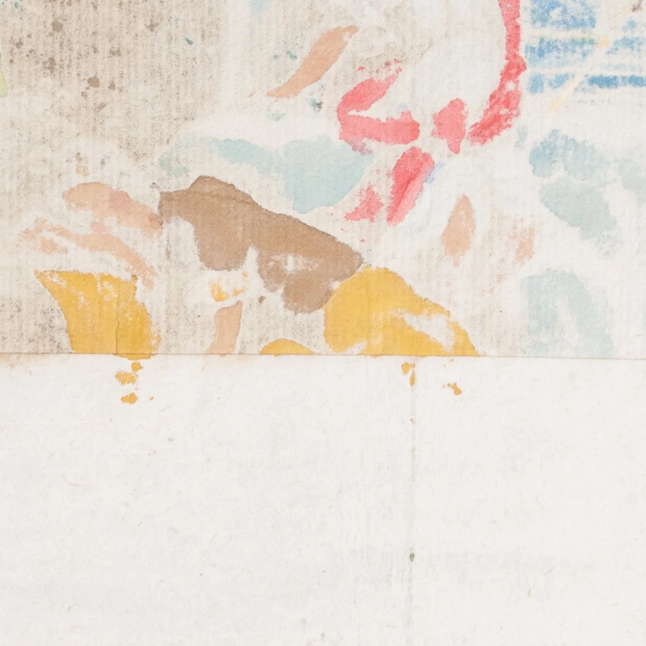
The 1708 edition of the annual Augsburg Peace Painting, a long-standing element of the Augsburg Peace Festival, still celebrated today as a local Augsburg holiday on August 8. Augsburg Protestants lost the right to practice their faith during the Thirty Years War, and the festival celebrates the reestablishment of those rights. The tradition of giving a "peace painting" (Friedens-Gemähld) to local Protestant schoolchildren dates to at least 1651 and endured throughout the eighteenth century. The title itself references this tradition, der evangelischen Schul-Jugend in Augspurg...ausgetheilet. ¶ Our is a typical example of the genre, the upper half illustrated with a scene from the Bible—Jacob's Ladder in this case—accompanied by rhyming verse in the lower half to explain the image. The people of Augsburg here tapped one of the best local talents for this work. Thelot was an exceptional craftsman, a master goldsmith remembered today for his impressive work in high relief, "considered by many to be the best artist of his time in this medium" (Vincent). ¶ We here offer not one, but two copies, an exceptional opportunity for side-by-side comparison of colored and uncolored copies of the same broadside. Black-and-white prints of course have their own austere beauty—in our own opinion anyway—but viewers valued color tremendously from the earliest days of print, when "color was often integral to the conception and meaning of printed images" (Dackerman). The color here is vivid and expertly applied, likely the work of a professional colorist, and probably cost a small multiple of the black-and-white version. For a 16th-century example, the prices of Hieronymus Cock's hand-colored prints were four to five times those for black-and-white work. ¶ Suspicion of the age of hand coloring inevitably haunts such prints. One study of 15th-, 16th-, and 17th-century prints demonstrated that pigments used were overwhelmingly appropriate for contemporary color, belying the frequent assumption that hand coloring must have been a more modern enhancement. A strip of laid paper on the blank verso here joins the engraved upper half to the letterpress lower half. This strip picked up a bit of the color, and so must be strictly contemporary with the coloring. And we suspect this was as issued rather than a later repair. The paper of this joint has the texture of felt from couching the paper, as we'd expect from a hand-press sheet. (There was also a hard crease in this paper before it was applied to the print, which no modern, self-respecting conservator would stand for.) Meanwhile, more recent repairs at the edges use a different paper, and which notably lacks any pigment (like the red that heavily soaked through in one spot). A hard crease has formed above this joint. In the robe of sleeping Jacob, one can just discern a pinprick of lightened color, suggesting gradual wear to the color from creasing. All to say, we're inclined to consider the coloring contemporary. ¶ An enduring, ephemeral contribution to children's literature, and an exceptional opportunity to evaluate what color can add to (or detract from) a black-and-white print.
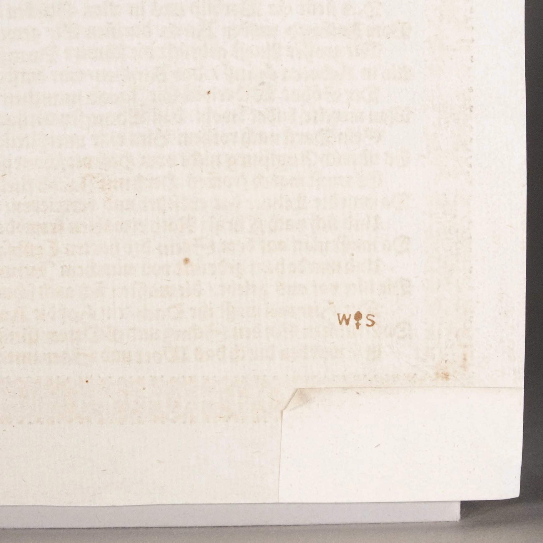
PROVENANCE: Small red stamp on the verso of the colored copy, the initials W and S flanking what we suspect is a pinecone, the emblem of the city of Augsburg, and so perhaps the stamp of an Augsburg print collector. We do not find this stamp in Frits Lugt's Marques de collections.
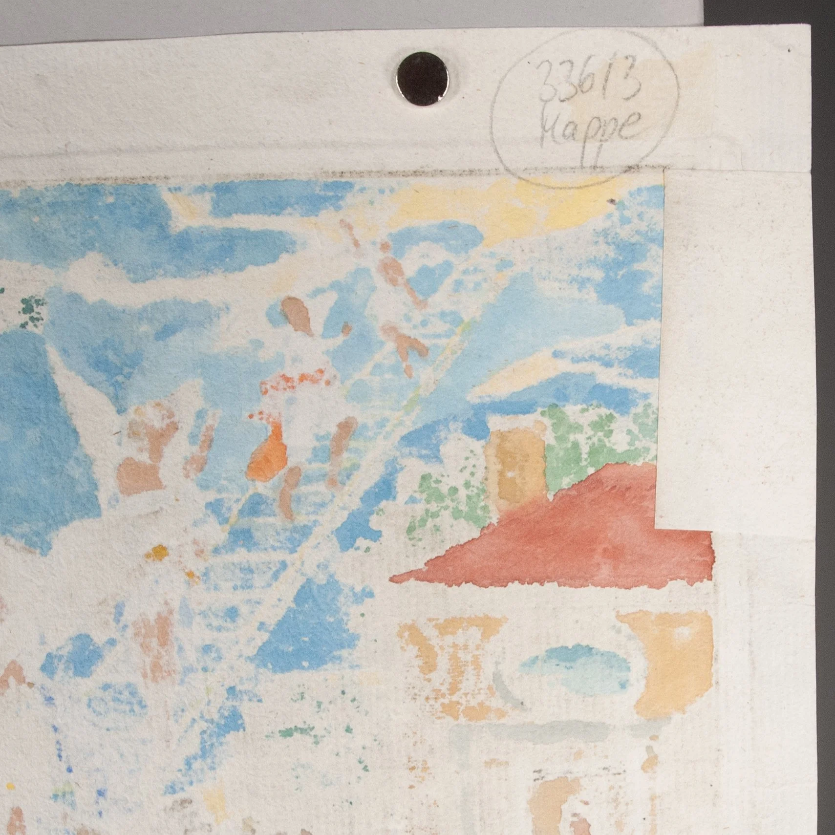
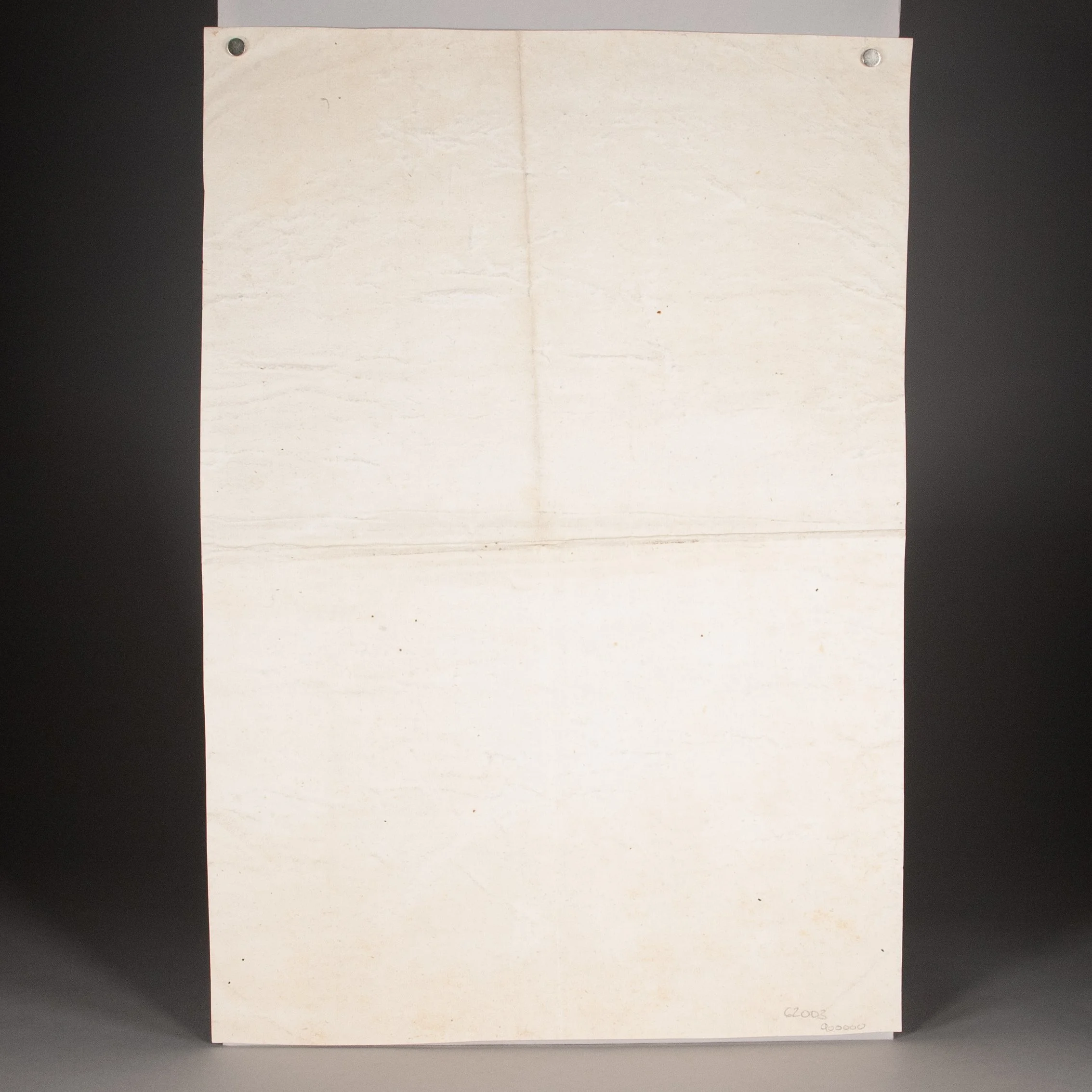
CONDITION: Each printed on the recto only of a full sheet of laid paper, watermarked with an Augsburg pinecone. The text set within an ornamental border. ¶ Black-and-white copy: Mounted to another sheet of paper, and with a hard crease across each dimension; trimmed very close, just sparing any content, but touching the plate border; 2" tear in the bottom edge, affecting text, repaired by virtue of the mounting; a bit dusty. Colored copy: The two halves joined by a strip paper, as described above; hard crease across the middle above the paper joint; four marginal repairs on the blank verso, the most offensive for a 1.5" closed tear in the bottom edge (affecting ornamental border and a tiny bit of text; a trifle soiled.
REFERENCES: Clare Vincent, European Clocks and Watches in the Metropolitan Museum of Art (2015), p. 136 (cited above); Susan Dackerman, "Introduction: Rediscovering Painted Prints," Painted Prints (2003), p. 2 (“Painted prints are a hybrid art form, both printed design and painting. Often the painting on the prints was not executed by the printmaker himself, but by a professional print colorist."), 3 (“Uncertainty about the vintage of the coloring has also obscured the art-historical significance of colored prints. The number of prints painted during the sixteenth and seventeenth centuries has been underestimated because it was assumed that many hand-colored prints were the consequences of modern embellishment.” Her study, however, found that the “majority of the prints tested were painted with materials characteristic of types used in the fifteenth through seventeenth centuries."), 11 (cited above), 28 (for Cock's prices); Thomas Primeau, "The Materials and Technology of Renaissance and Baroque Hand-Colored Prints," Painted Prints, p. 50 (In a study of sixty early prints, “the vast majority were probably colored around the time they were printed. This demonstrates that the practice of coloring prints was common during the Renaissance and Baroque eras and that modern questions about the vintage of the coloring are often unfounded.”)
Item #796